– Case Study

International Sales Platform

Outline of the project
The project
The International Sales Platform enables the BBC sales teams to sell licensable content to TV channels and media giants around the world
Project overview
High profile project across the organisation
Stakeholders and users cross over
First in-house UX team at BBC Studios, working on strategy and delivery
Hard deadline for MVP due to external platform supplier at risk of insolvency
Moving from a build and launch to build and improve, product model
Studios brand development
My role, design and UX direction
Creative Director
Setting the scene
Setting expectation of the role of UX within the project
Workshop and meeting facilitation to bring the teams in line with each other
Ensuring user centred approach consistent with the rest of BBC
Challenging the status quo
Ongoing project support
Visual design and UX direction (user flows, IA, wires, interactions)
Language and microcopy direction
Creating opportunities for user research (budget, timeline, scope)
Alignment with BBC GEL, and other BBC products where possible
Managing brand change and digital output
Growing team, establishing culture
The Stakeholders
New to UX as a discipline
Establish myself and my team as leaders and decision makers
Gaining trust, open backlog, regular 1-1s, weekly design updates, interactive workshops
Interviews with key teams and senior stakeholders, understanding their ways of working and introducing ours
Setting expectations, breaking down usual ways of working without undermining their seniority
“Help me discover great content to pitch to my clients around the world”

The project team
New UX team recruited for the project
2 UX designers, 7 engineers (fe/be), 1 product, me
Ownership and autonomy
On-boarding process for individuals, project, BBC and UX&D
Team dynamics
Clear objectives and expectations established
Team culture, collaboration, learn, play
Understanding the users
User interviews were conducted to ensure we understood our users needs, wants and behaviours

Sales Executive
Motivated by:
Building relationships with clients.
Discovering great content
“Help me discover great content to pitch”

Client / Buyer
Motivated by:
Filling schedule slots
Discovering great content to make the client successful
“I need to watch a lot of video! Help me get the info I need as quickly as possible”

Wire frames, prototypes and copy
Weekly design reviews
Encouraging holistic thinking across problem areas
Workshopping the knotty problems
The concept of the video home page was that - whilst searching, video snippets introducing the content are played in the background. The user can explore these via a system of tags
Video homepage with central search proof of concept was an idea which would allow the user to understand the feeling of what happens at Southbank Centre without having to click anywhere or work to hard to find out what Southbank Centre is about.
This in itself was highly successful and allowed us to secure funds to move on with the project.
Discovery stage - initial ideas
We ran a series of website advisory group workshop sessions to engage the organisation with the project. We also ran workshops with external agencies Bureau of Visual Affairs and Cogapp to get the big thinking on the table.
Initial thinking and focuses
Open Data and Semantic Search
Humanising interfaces to extend a warm welcome
A communicated festival
Global reach
The social purpose / learning at the core
Focus on user needs
Communicate the breadth of content

Personas
User personas are used to ensure the site is focused on real user needs rather than solely on internal or organisational needs. We revisited and refined our personas and identified a primary persona to help us focus on the core user needs of the website. Below is a brief outline of our primary persona, the full persona was more detailed and included goals, motivations, frustrations, technology usage patterns and brand loyalty.
Primary persona
Wendy Speed (30-35): "What’s on when I’m free"
Events Manager, living with her partner and young child in London.
During her free time, she regularly visits tourist & visitor attractions, including theatres, galleries and museums in London with her family and friends.
She’s interested in a range of art forms and events, including those suitable for children.
The Glass box - being transparent
In the spirit of openness we (the dev team) partnered with Web We Want festival to work in a truly open way by setting up our team and working in a glass box within the Southbank Centre for 16 weeks. We worked in the middle of the Royal Festival Hall to be a direct point of contact with our users and colleagues from other organisations such as the Barbican. We tested our products, displayed our designs and asked for feedback and ideas from the customers. We ran workshops, met our users, tested our projects and shared ideas. It was an eye opening experience. Read more about it here.

Research
External UX consultancy Bunnyfoot conducted research with real people:
6 senior Southbank Centre stakeholders were interviewed
2 workshops with the wider Southbank Centre team were conducted
3 peer websites reviewed
1,244 online survey responses gathered
28 people user tested on site at Southbank Centre and in a usability lab
100 people validated the proposed new website structure
We used this research as a base for our initial thinking, but extended it throughout the project.
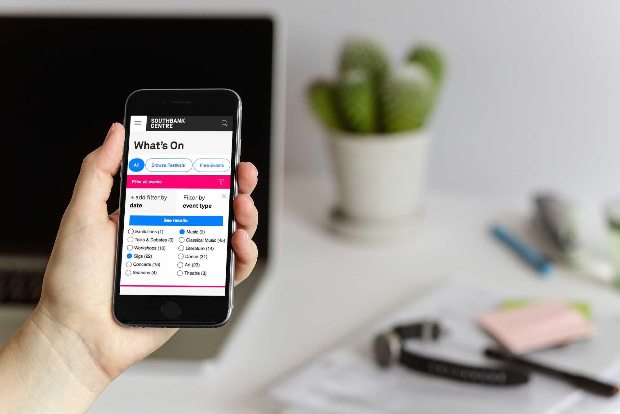
IA Design
In order to create a successful IA which would support findability and usability we had to pull our current IA apart and start from scratch. Southbank Centre has many cross genre/cross artform events and exhibitions. Alongside many other types of event such as festival, long running events and one off events. The list is long and complex and nothing fits neatly in 1 section.
It was my job to design an IA which would support this whilst maintaining a coherent structure. It was decided early on we would need the search to be absolutely key in the user journey - not only to find events but to lead into related content intuitively.
We decided to design an non hierarchical IA which would guide users through content rather than organising the content into places from the top down. The pages would be made up of modules which would interlink between event and content pages.

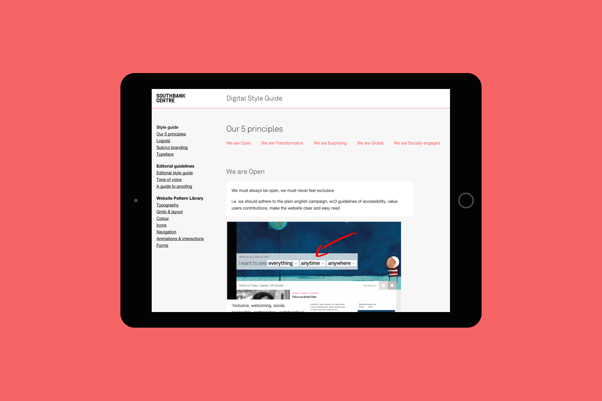
Digital Brand
When the website project kicked off, Southbank Centre had no digital brand guidelines. A re-brand was on the horizon so we needed an interim brand which could be picked up easily in the future and co-exist and develop alongside the re-brand.
I lead the project to create a digital style guide and pattern library to allow the team to have a focus when creating the new website. We ran workshops with stakeholders and engaged with customers to create 5 principles to guide the website - Open, Transformative, Surprising, Global and Socially Engaged.
We then started to create the grid system, typographic style sheet and some initial icon styles. With the developers we created code based styles to publish publicly on the online style guide here.
The pattern library lives here. southbankcentre.org/style-guide

Tech Integrations
In my role as Scrum Master I coached the team when we took on the back end system integration work. We built a bespoke Drupal CMS specifically for the website in order to link it up to other systems and work with the Southbank Centre's complex set of needs.
Api built to connect Drupal with Artifax, Consultation on new Digital Asset Management systems, Tessitura considerations and integrations, Drupal as an Open CMS development work. We discussed and decided on systems and hierarchies, naming conventions and groupings of data, ontology, taxonomy and architecture.
Designing for change
In order to design a fully adaptable website, I lead the design using a modular approach. We approached each entity as a module rather than a page template. Each page would have to be flexible as each event and/or content page would have different needs. Some events may have multiple content blocks including video/image galleries/sound clips/reviews etc and other events would have basic information such as time, date, price.
We applied this approach to the back end by decoupling the front and back end. The back end using Drupal and the front end using Angular JS.

Wireframing and UX
We held group wireframing sessions to enable the whole team (including developers, project managers, sys admin etc) to input into the beginning stages of the work. It helped iron out any grey areas when it came to design and allowed us to design solutions which were achievable in the sprint time allowance. This didn’t mean we couldn’t think outside the box - I often challenged the developers and they equally challenged me and UX analyists. It was a healthy and productive way of working.
We used the wireframes to help create and flesh out user journeys, taken from user stories based on our personas.

Prototyping and testing
Once we had user stories, wireframes ready to go we designed and built interactive prototypes to test with users. We tested them with real people who matched our persona - focusing on our primary persona ‘Wendy’. We ran lab based and more informal on site testing sessions. Our UX Analyst ran these and I was involved in preparing goals for the sessions, prototypes, listening to and implementing relevant feedback.


Design Iteration and live site
Once the tests had been done and analysed, the design iterations were made and designs passed to development to be built. The first iteration of the new design was for WOW festival 2015. It incorporated a basic introduction of the new look and feel, the new grid and the first version of the CMS. We pushed it live for the festival which in itself was a huge success being able to launch something which was not a finished product - a big step forward for the organisation.
We immediately had real feedback from our users and our in-house team was in a position to not only fix problems there and then but learn from the analytics and work reactively to improve the experience for users.
